How to run functions for comparative analyses in Arbor
So, you want to use the Arbor web app to do some comparative analyses?
The Arbor web app is a flexible workflow engine that will let you carry out a wide range of visualizations and analyses. You can upload data files from your computer, or use data from a range of web services.
For this example, I will walk you through the steps you need to use the Arbor web app. I will set up a basic analysis of a correlation between two continuous characters using independent contrasts.
Get started
You will need the anolis example data files, anolis.phy and anolis.csv. Save those files somewhere on your computer.
Now open the Arbor web app (this is a special instance of Arbor hosted on Amazon Web Services just for this meeting). Your screen should look something like this:
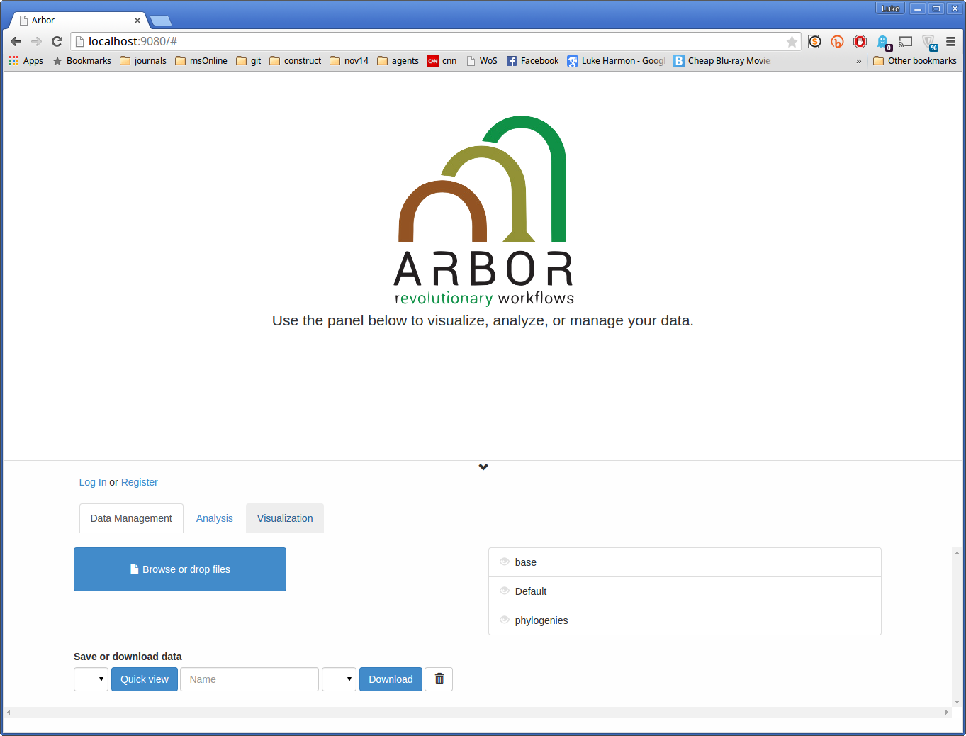
You might notice some differences between this screen and the particular collections that are available to you - don’t worry too much about that.
If you want, you can log in here; your user name should match the personal part of the email address you used to register for the meeting. For example, if your registration email is lukeh@uidaho.edu, then your user name is lukeh. The password will be given to you by the instructor. Note also that for this and some other examples in the workshop, you don’t actually need to log in, you can do the analyses on the web without an account.
Upload your data
Near the bottom of the Arbor web app screen you will see a blue box that says “Browse or drop files.” This is how you can get your data into Arbor. There are two options: either you can click the box and browse to the file you want, or you can drag the file onto the box and let go. Arbor should recognize what type of file you have added (in this case, tree or datafile) and store them in the correct way.
Using this method, load in both anolis.phy and anolis.csv. If you want to make sure that your upload worked, you can use the dropdown menu that says “Save or download data.” If you have properly loaded the files you will see them appear in that list.
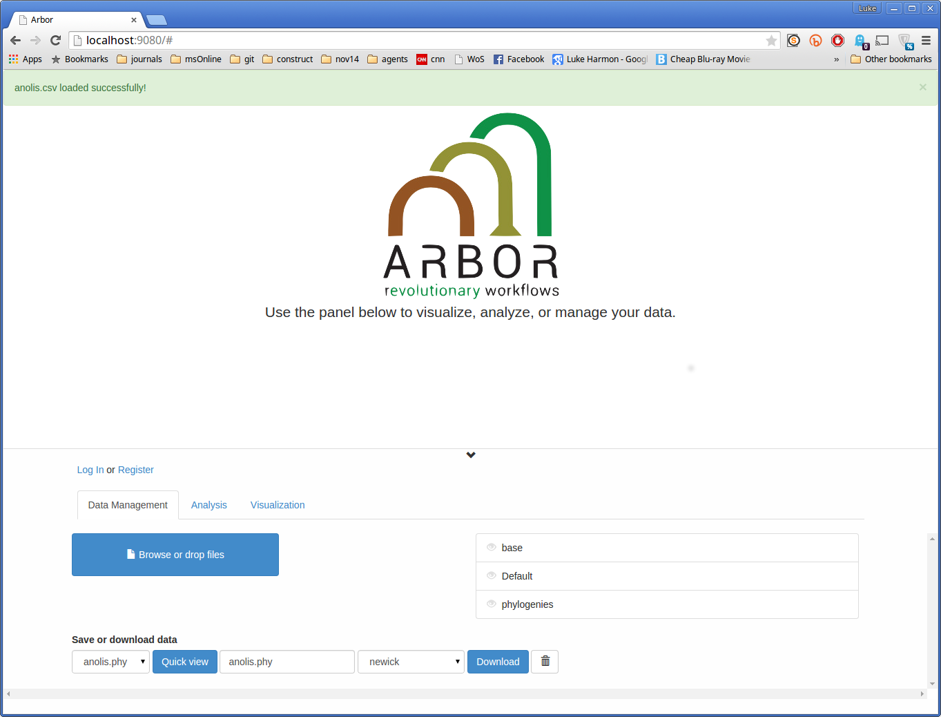
This is what my screen looks like after uploading anolis.csv - note that anolis.phy is also in the “Save or download data” dropdown, as I uploaded it just before.
Note: Since you have not added your files to any collections, they will appear like this:
- anolis.csv
- anolis.phy
You may also see the same files stored in a collection, depending on how your web app is set up. If you see versions of those stored files from the “sampleDatasets” collection, for example, they will look like this:
- anolis.csv (sampleDatasets)
- anolis.phy (sampleDatasets)
Those stored files will work fine for the exercise, but try to use the ones you uploaded so that you can get the hang of using your own data in Arbor. Also, since these datasets are uploaded but not saved, if you refresh your browser or even accidentally go to a different page, the datasets will be gone when you come back. If you want to save your uploaded data then you should login and make a personal collection.
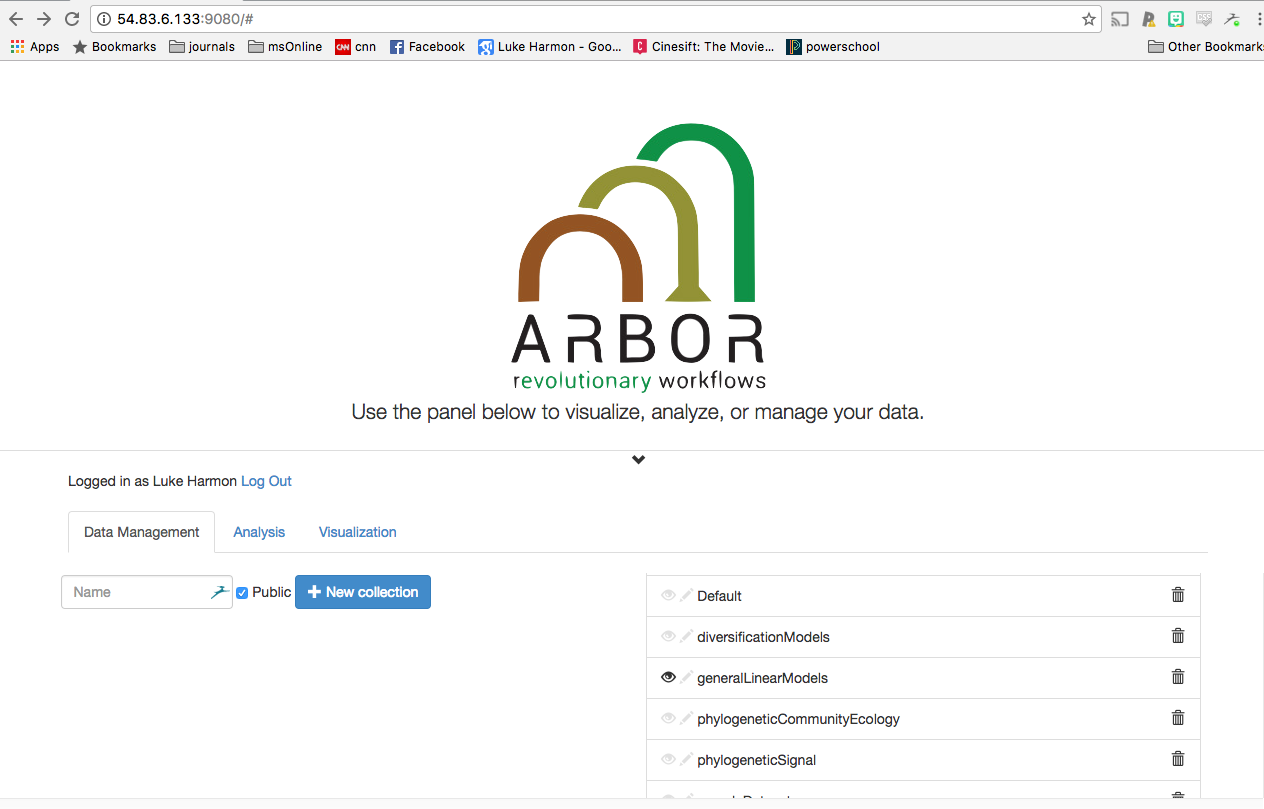
Select the collections you want
For this exercise, you will use functions from one arbor collections, “generalLinearModels.” This collection contains functions to test for linear relationships among a set of variables. All available collections are listed to the right side of the Data Management tab.
To gain access to functions in those collections, click the little eyeball next to “generalLinearModels.” Your screen should now look like this:
Navigate to the “analysis” tab
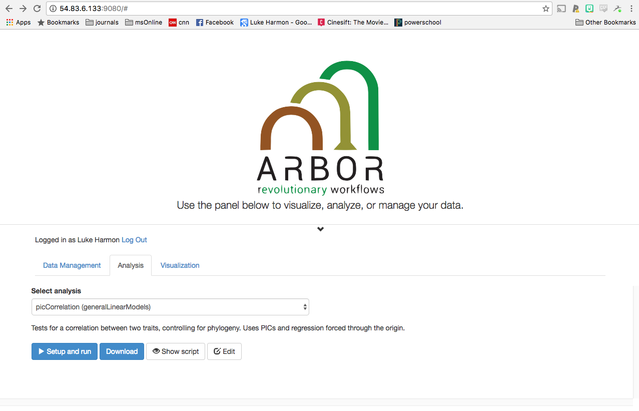
You are done with the Data Management tab, and will need to move to the “Analysis” tab to carry out your analysis. Click on the Analysis tab to switch. Your screen should now look like this:
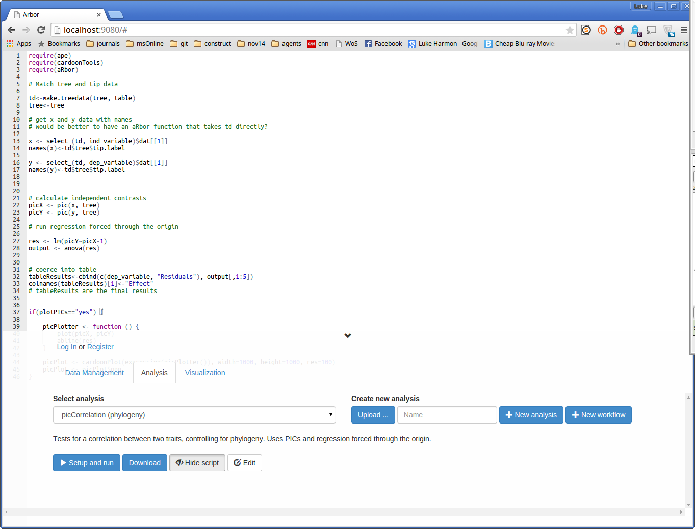
Try out the picCorrelation function
We can now do some comparative analyses! Arbor has two types of analyses: functions and workflows. Later, we will build a workflow - but actually, for this problem, there is a single function that we can use to get output immediately.
The function we need is called picCorrelation, and it is part of the generalLinearModels collection.
First, select this function (in the Select analysis dropdown menu). You can inspect the function by clicking “Show script” (this example is in R). You should see this:
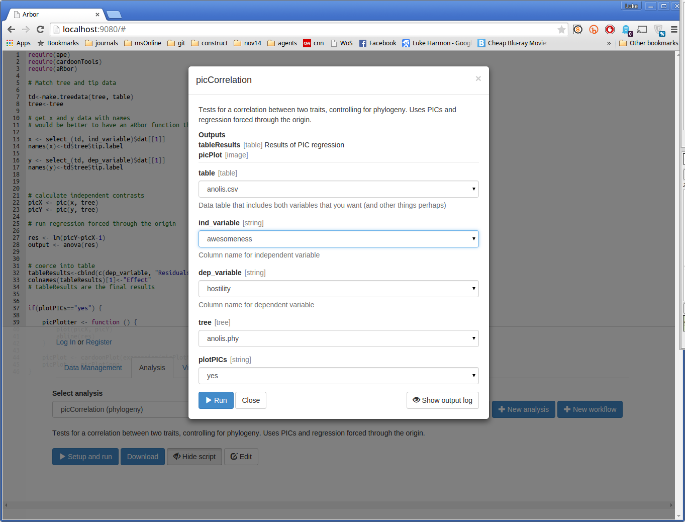
You can now run the function by clicking the small blue button that says “> Setup and run.” This brings up a dialog box. Fill in the missing details in this box to analyze hostility (dep_variable) as a function of awesomeness (ind_variable). Choose the table and tree that you entered earlier, and set “plotPICs” to “yes.” Your form should look like this:
Now press “> Run” and see what happens. If your run works, you should see a success message:
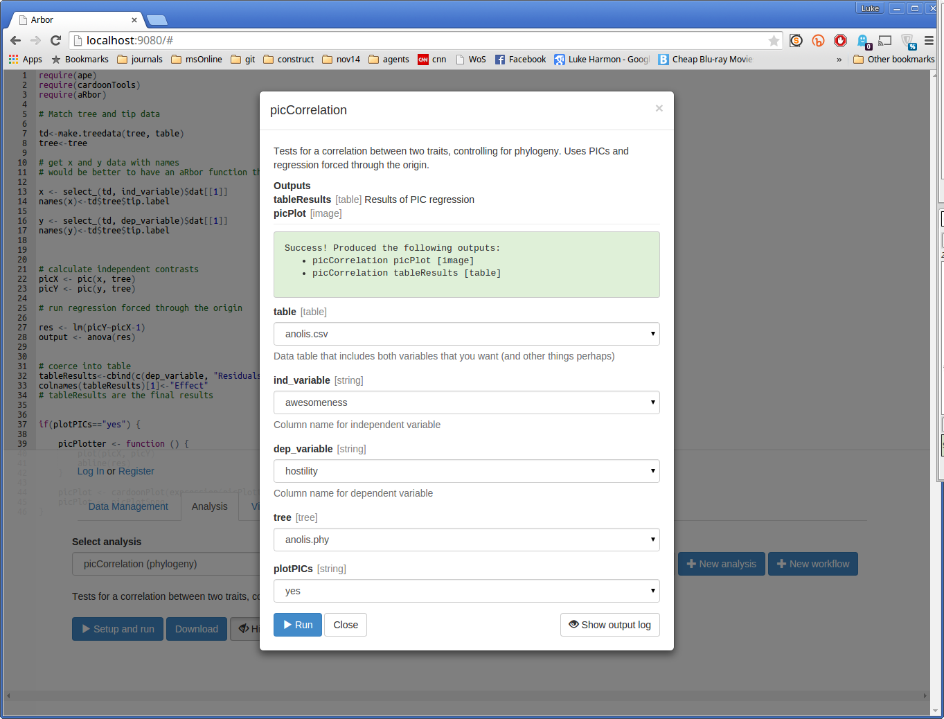
Here, Arbor is telling us that the function had two outputs:
- picCorrelation picPlot, which is an image
- picCorrelation tableResults, which is a table
Let’s have a look at the outputs.
Visualize the outputs of the picCorrelation function
To see the outputs of an Arbor function (or workflow) we can go to the Visualization tab. Click on it now. Your screen should look like this:
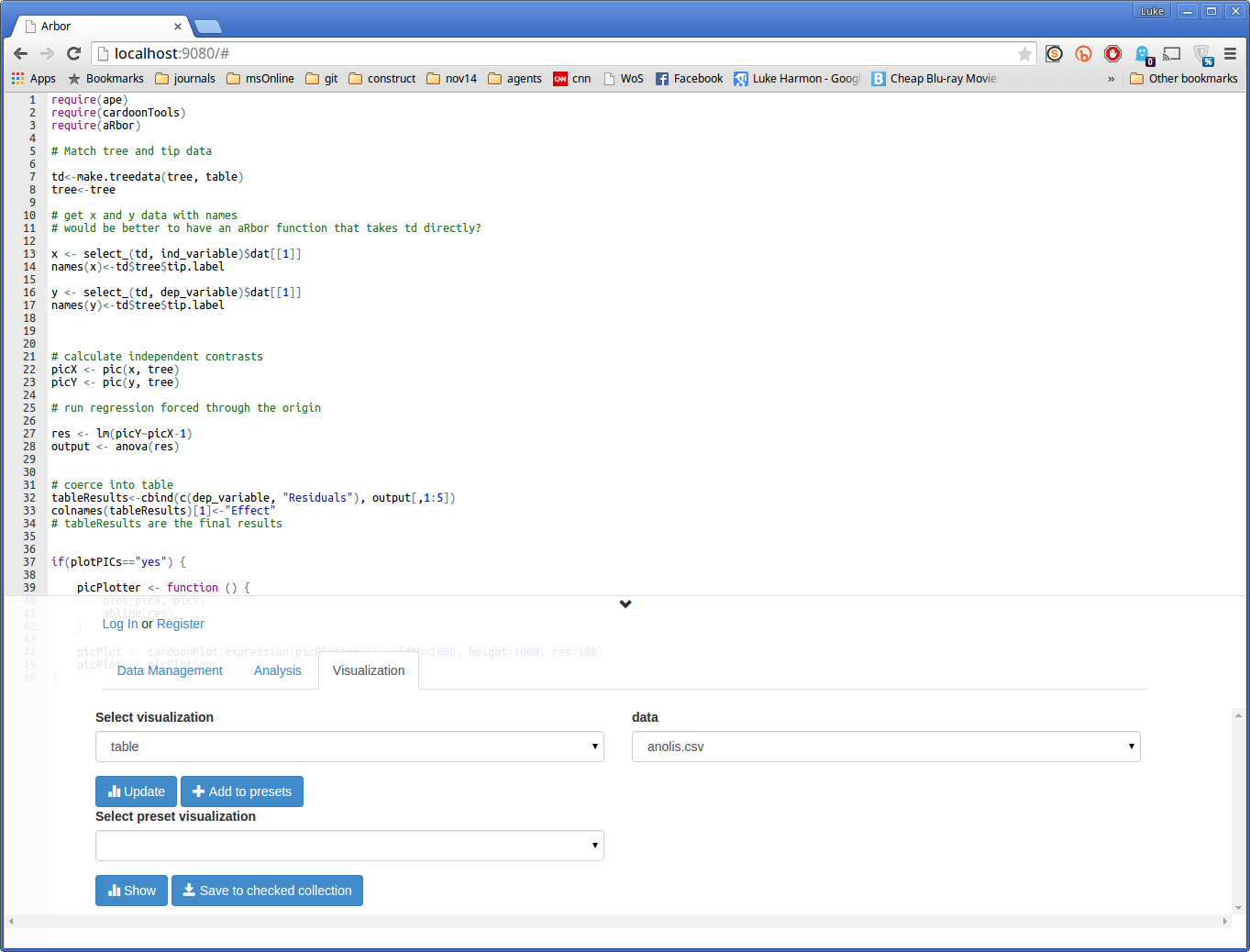
Note that the top part of the screen did not change, but the bottom tabs and buttons did. That’s ok! Keep going.
We can look at the plot first. Set the “Select visualization” dropdown to “image”, and you should see your output, called “picCorrelation picPlot”, appear under “data.” To activate this visualization click on the blue Update button. The result should be a plot.
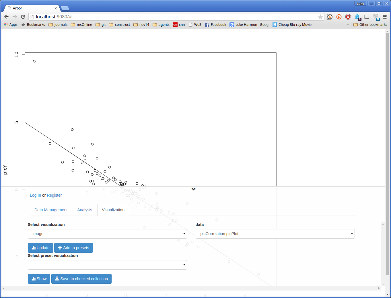
(You can see more of the plot by clicking on the small downward-facing arrow above the “Log In or Register” section of the screen).
Next, let’s see some numbers. Change “Select visualization” to “table”, and “data” to “picCorrelation tableResults.” Hit update again to see an ANOVA table summarizing the results of the phylogenetic regression.
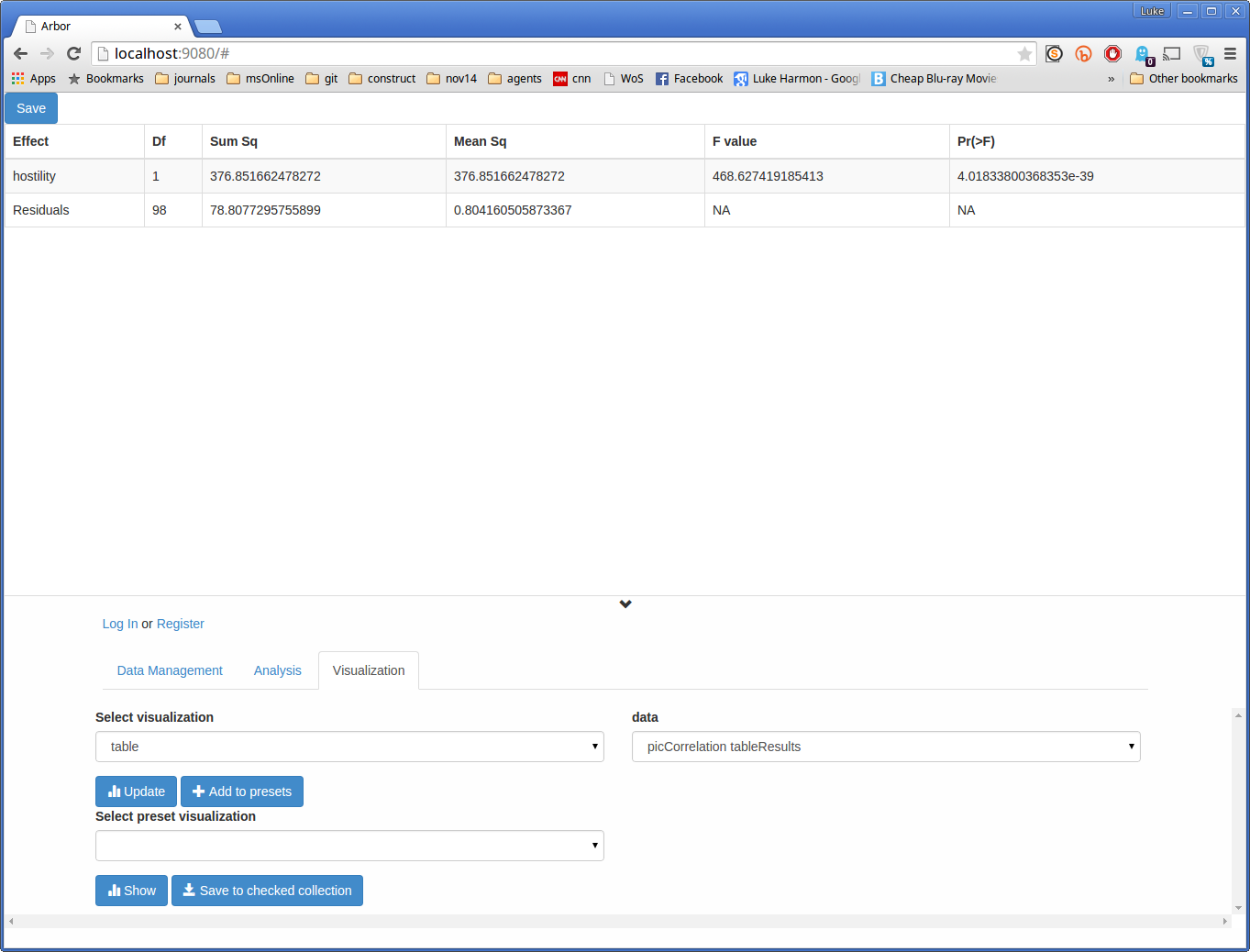
The p-value is the top number in the column denoted “Pr(>F).”